The problem
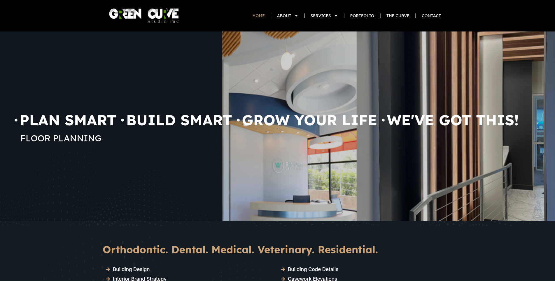
GreenCurve Studio is an interior design firm specializing in dental, pediatric, and orthodontic office design, and their site wasn't showing that off. Portfolio images had inconsistent sizing across the site. The services list in the header was completely illegible on mobile. There were no dedicated pages for any of the studio's three core specialties, and no way to show off the geographic reach of their project list, which stretches internationally.
What I built
Rebuilding the homepage around the portfolio
I built a custom slider with its own design elements and animation, and rebuilt the portfolio section so each image is clickable, opens individually, and preserves its native aspect ratio instead of getting force-cropped into a grid.
An interactive map for a global project list
I added an interactive map plotting the studio's projects, including an international location in Harare, Zimbabwe, alongside the portfolio slider, so visitors can see the geographic range of the work as easily as they can browse individual projects.
Landing pages for each specialty
The studio's three core specialties, dental, pediatric, and orthodontic office design, each got a dedicated article-style landing page, adapted from homepage content per the client's direction, so each specialty could rank and convert on its own.
Fixing the header for mobile
The services list that used to scroll across the header was illegible on small screens, so I moved it out into its own dedicated section below the header, keeping the full-scope messaging intact while making it actually readable on mobile.
Team section, chat widgets, and the rest
I built a dynamic photo gallery for the team's "Out & About" photos, linked an awards page from the footer, added a location slider showing state and country, and evaluated both a WhatsApp click-to-chat widget and Tawk.to live chat for client communication. Everything got tested and fixed individually across desktop, iPad Mini, tablet, and mobile, and the footer was rebuilt with proper linking throughout.
What actually changed
| What changed | Before | After |
|---|---|---|
| Portfolio display | Inconsistent sizing | Clickable images, native aspect ratio |
| Mobile header | Illegible services list | Clean, dedicated section |
| Service specialization | No dedicated pages | Three targeted landing pages |
| Global presence | No map | Interactive project map, international reach |